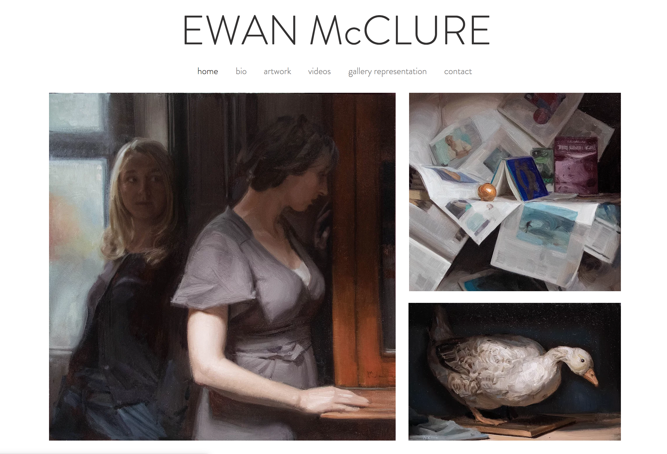
Last year I was pleased to have three features published in Artists and Illustrators Magazine. Here are the complete, unedited versions.
True Colours

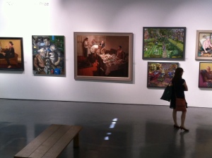
A tour of any art fair or open exhibition reveals that one field of enquiry persists and thrives amid a kaleidoscope of changing artistic trends and category-defying innovations. That field (loosely defined) is realism. Encompassing everything from classical realism to photorealism and impressionism, the common aim is an illusionistic rendering of the forms and sensations of the visual world.
It’s worth noticing, however, that it’s relatively rare to be struck by truly naturalistic colouring. Whether by accident or in a deliberate bid to improve on nature, painters tend to distort their colours in one way or another, and a unique slice of truth is lost in translation.
To limit the scope of this troubleshooter, I’ll just focus on the particular challenge of recreating a subject’s colours faithfully, through careful observation and accurate colour mixing. I won’t offer colour theories to guarantee more picturesque results, but will encourage the reader to build paintings with true notes of colour, entrusting harmony and interest to the choice of subject, unadulterated, under its unifying light.
- “I struggle with the limited contrasts offered by paints”
Have you used the reddest red on your palette for the apple and you’ve nowhere redder to go for the strawberries? Are you loading the white into the mid tones and can’t paint a highlight bright enough to sparkle? Clearly it’s time to demand a refund from your supplier for selling feeble paints! Or it could be that you just need brighter illumination on your canvas.
In this demo I painted the same still life three times, changing the amount of lighting on the canvas by varying the proximity of the lamp. The lesson might be rather elementary but I think it’s worth illustrating what an impact this one variable can have.

Example 1 was painted with the lamp very close to the canvas. The glaring brightness forced me to tone all the colours right down until they looked correct. Of course, when viewed under normal ambient light (1b) the result is a very dark painting with a rather burnt looking croissant.
For 2 I moved the lamp further from the canvas to achieve a more optimal light. The full tonal range of the still life could be captured, from the whites downward, and unlike 1 the tonal balance still looked right when hung on the wall (2b).
3 was attempted with the lamp shifted well away. The shadows could be rendered as seen, but under such inadequate light the middle tones demanded a lot of white mixed in to make them approach accuracy. That left nothing in reserve for the lightest lights, and the white paint, when compared to the actual table cloth, looked dull grey, even when laid on with a trowel! (3a) Painting the orange to look bright enough relative to the croissant, while maintaining colour intensity, was impossible. Adding even a little white to lighten it muted it from a fiery citrus to a pinky orange. Comparing 3b to 2b, notice how much more distinct the chroma (or relative colour intensities) are between the orange and the croissant in 2.
We can’t always count on optimal lighting arrangements, especially in outdoor painting, but it should be among the first considerations if difficulties arise.
- “My colours look muddy or exaggerated”
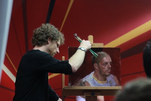
“If you look into the past of any successful painter you will see square miles of canvas behind him. It is the work that counts, experience in seeing color.” Charles Hawthorne
Ever struggled to make sense of individual colours before you? Seeing colour and reproducing it in paint becomes instinctive with practice, but it won’t happen by accident – it must be a deliberate priority.

Valuable experience and a keen understanding can be gained by mixing colours of anything and everything, testing samples right up close. This isn’t about memorising colour recipes, but about tuning your eye to the particularities of colours in isolation. I recommend always arranging the paints in the same order on your palette so you’ll come to reach for them instinctively.
If a work in progress is in a state of vague approximation, taking time to get just one note exactly right helps guide subsequent notes providing a visual anchor to relate them to.
- “I struggle to capture a spatial context in colour”
Are your colours sometimes naive and flat, countering any illusion of depth? This can come from falling back on the colours you expect, rather than scrutinising and trusting what you actually see. Even the brightest furnishings and whitest snow are tempered by the colour of the light source, reflected colours, and shadows. That’s a lot to consider, but it boils down to a few simple considerations – is it lighter? Darker? Warmer? Greyer? etc. The answers tell you where to reach on the palette.

As an exercise in challenging my assumptions, I placed this bowl of lemons alongside a piece of stained glass and a bottle, all strongly backlit. I had to fight the urge to use the bright yellow I expected on the lemons, and instead just kept asking myself how things actually looked in this unfamiliar context.
- “I want to keep my colours bright”
Ever felt doubtful about browns and ochres on the palette? When looking to eliminate superfluous tubes of paint, the earth colours might seem to be dispensable, since fair approximations are mixable from the three primaries, as illustrated below.

(Here I’ve mixed raw sienna, burnt sienna, both of which are staples on my palette, as well as terre verte.) So would I recommend discarding my earths and travelling light from now on?
Well I can’t deny one virtue of this approach. Aside from the moments saved by squeezing out fewer tubes onto the palette, there’s also worthwhile colour mixing experience to be gained. Exploring the range of possibilities of a primary colour palette, and learning how to neutralise bright colours with other bright colours teaches the lesson that contrasting pigments cancel each other out.
However, here are just a few arguments in defence of these time-honoured paints.
- Earth colours are in the cheapest bracket, unlike most spectral paints.
- Mixing neutrals from rainbow colours wastes time, interrupting painterly flow, and each attempt to achieve the same mix is open to error. For less mixing, use tube colours that already resemble the subject!
- Those counterfeit mixes are only superficially equivalent. See how differently they behave when mixed with white to create tints? Pure, unmixed pigments produce richer tints.

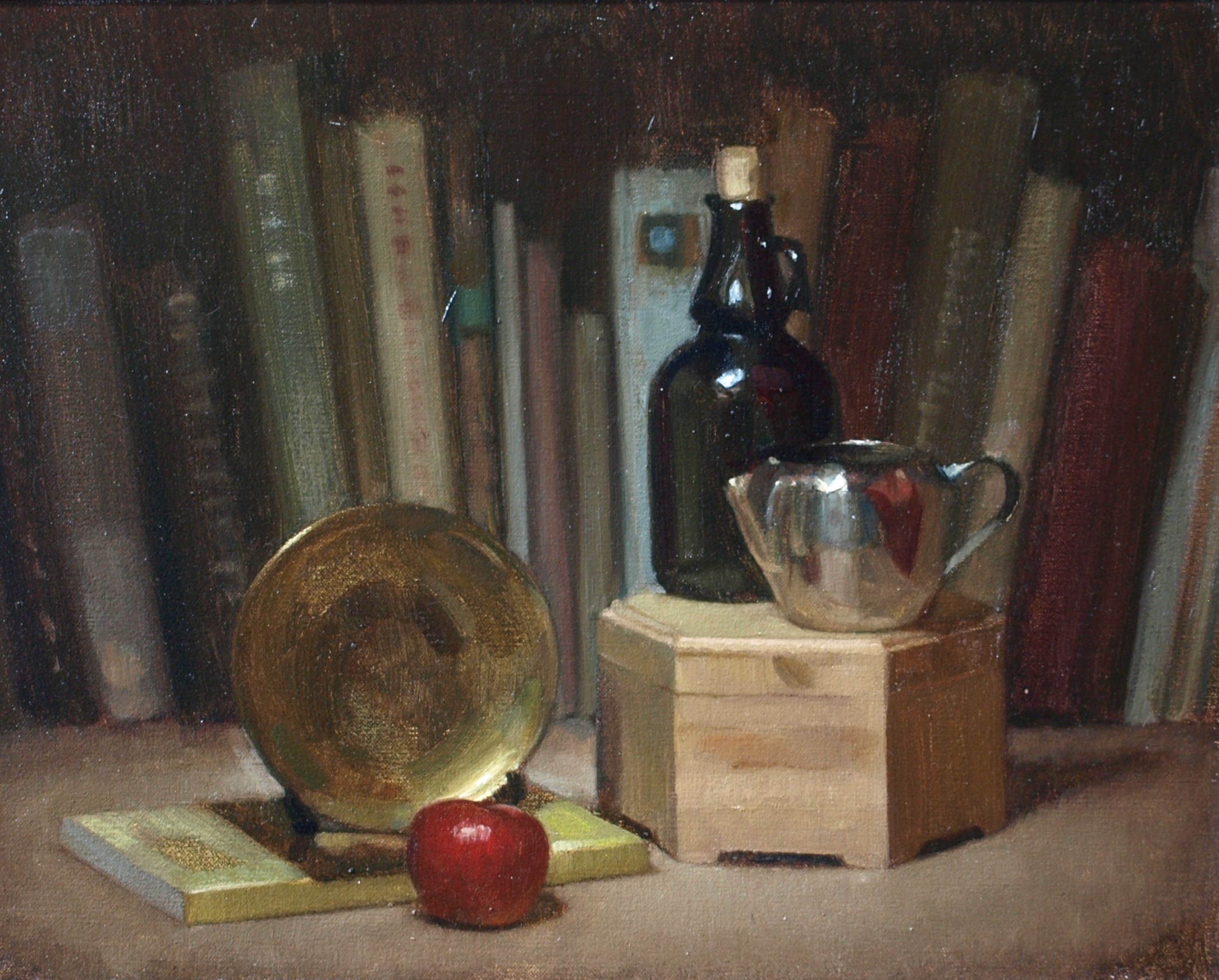
- The earth colours, plus white, yield a broad palette of skin tones. And the pairing of burnt sienna and ultramarine plus white, provide useful warm and cool greys. They were just about all that was required for this metallic subject.

- “My paintings about colour just look like studies of objects.”
Ever painted something purely out of interest in its colour, only to be asked to explain the point of the subject? I have, and while the question might seem naive, it usually points to a failing in the mode of expression. For example, it might be unnecessarily detailed. An overly descriptive rendering of material facts suggests to the viewer there’s some symbolic significance to the objects themselves. Therefore, to guarantee that the image is unambiguously ‘about colour,’ it’s worth subordinating all other elements. Downplaying tactile form might entail a more general softening of edges to emphasise the intangible radiance of colour. Tone is an intrinsic component of colour, but it can be subordinated by avoiding dramatic light and shadow, favouring a front-lit arrangement where shadows fall behind the behind the subject, mostly out of sight.

The Value of Tone
The topic of last month’s troubleshooter was colour in naturalistic painting, and how to capture colours faithfully. This time we’ll home in on that fundamental element which conveys light, shade and three dimensional form – tonal value. It is the secret behind the illusion of weight and solidity in painting and should be the first port of call whenever any part of a painting looks flat or insubstantial.

Of course the word ‘tone’ is sometimes used rather vaguely, so let’s keep to a strict definition. It is the property of lightness or darkness found in any colour. Unlike the ‘hue’ (the redness, blueness, greenness, etc.) or ‘chroma’ (the saturation or greyness) tonal values are captured in black and white photographs, so viewing any painting in black and white clearly reveals the tonal structure without other distractions.
“I’m confused by colour and complexity. How can I see things tonally as I work?”
Be in the habit of squinting at your subject, not at your painting. Gently half-shutting your eyes when looking at the subject helps in the perception of tonal relationships by inhibiting detail and broadening focus. Areas that are similar in tone mass together as abstract shapes. The challenge is to paint faithfully what you perceive when squinting, and not expect to find answers among small details, or falling back on preconceptions.

Of course, while squinting simplifies the scene, it doesn’t entirely eliminate the complication of colour. Setting your digital camera to the black and white mode and comparing your subject and painting via the screen would be a more explicit way to identify any mismatches in tonal values. For a low-tech alternative, no batteries required, glimpse the world in monochrome by looking through a sheet of red or green acetate.
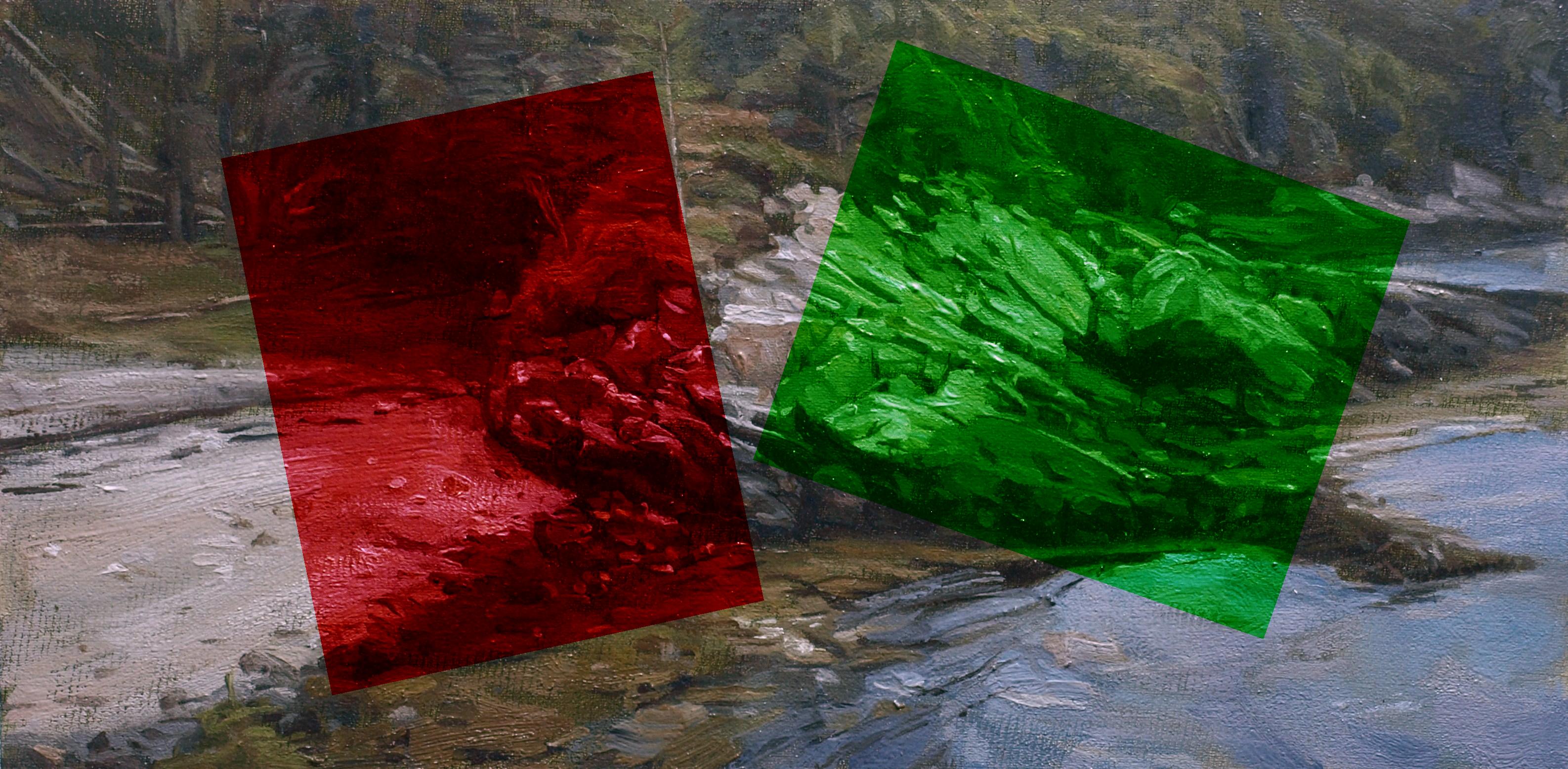
This won’t exactly reveal the ‘true’ tonal values, since through a red film, reds and warm colours will look tonally brighter, cool colours darker, the reverse being the case through the green film. But it’s still valid for making comparisons and jolting the eye into tonal awareness.
“I struggle to distinguish relative tones of different colours.”
The closer in tone two contrasting hues are, the harder it is to judge which is lighter and which darker. It simply takes practice to train the eye to sense the difference. By creating a greyscale palette like the one below, defining values from 0 (black) up to 10 (white) you can practise mixing colours and grouping them by tone on the vertical strips.

This is best done in good natural light. If the colour of the light source changes, then the relative tonal values will go out of kilter.
“My forms lack substance and solidity.”
Modelling forms to look tangible is a question of controlling tonal contrasts and searching out the transitions. In this self portrait demo I worked fairly systematically from dark to light using the greyscale palette.

The first panel has the darkest darks established, and everything else blocked-in up to a value 4 – darker than reality. Thereafter, I added lighter colours one tonal gradation at a time. It took some discipline not to artificially lighten areas which had already reached the correct value. The image evolves from under-modelled – large flat areas with too little tonal contrast, to slightly over-modelled, with too many contrasts in small areas.
“Can tone and colour be established in two separate stages?”
That might seem like a sensible way to break down the complexity of the subject – tone first, then colour on top. But while it is very good training to be able to translate a coloured subject into a monochrome painting, such a painting can’t simply be tinted into realistic technicolour by glazing it with local colours – the false appearance of a tinted black and white photo proves this point. Correct values will be darkened as soon as transparent colour is glazed on, and colour over grey looks dead through its depleted chroma.

In this demo, picture 1 is a reasonably faithful monochrome painting of the still life, roughly akin to a black and white photo. Picture 2 is the same painting with transparent colours glazed on top. Although it looks plausible, the red pepper was, in reality much more intense in chroma, but this couldn’t be recreated with a glaze over grey. Since the red of a red pepper is darker than the yellow of a yellow pepper, correspondingly distinct greys had to be used to be tonally accurate in the first stage. But this deadened the chroma of the red glaze. Picture 3 is a second under-painting. It is deliberately inaccurate in that I’ve ignored the tonal values of the local colours, depicting only the light and shadow, as if the vegetables were dipped in whitewash. However, on top of this fiction, true-to-life colours could be glazed, retaining their chromatic intensity.
“I can’t decide on a background tone for a portrait.”
In our eagerness to paint a subject, the background can all too often be a hasty after-thought. But even if it’s to be kept very simple, it should be considered as part of the whole, relating to and supporting the subject.

Having painted this profile on a white background I was curious to know what effect different choices of backdrop might have, all else remaining equal. I ruled out using strong colours to limit the experiment to a comparison of tone.
Against the first pale background the dark tones of the silhouette appear to be cut-out and flattened over all. There’s an issue with the unnaturally hard edge of the hair which should be softened, but notice how the equally hard edge of the top of the forehead appears softer and more rounded simply by having less contrast with the background. The surrounding tone dictates where edges are lost and found through tonal similarity. Against the second background with its middle tone, the close tonality of the forehead and background leads to some spatial ambiguity and a less defined profile than the first, while the neck and hair remains hard and cut-out through contrast. Finally in the third, the neck looks slimmer and more rounded, with a simple, logical, light to dark, front to back progression, and lost edges. The highest contrast is on the top-lit areas of the head, hardening and flattening that part of the form. I won’t pick a favourite, but compare how different contrasts affect the apparent size and shape of different features. Surrounding tone thereby can distort the very likeness of the subject.
Edges
In this month’s troubleshooter we’ll consider the role that edges have to play in enhancing (or compromising) the look of realism in naturalistic painting. As an area of study, edges are sometimes neglected, with most effort being directed at drawing, mixing accurate colours and applying them on target. But if we leave the hardness or softness of the edges of the brushstrokes to accident, then important visual clues about space, lighting, and material substance get overlooked. Edge quality is an invaluable tool of description. It is also a tool of expression, where a subtle manipulation of focus will guide the viewer through pictorial space, orchestrating the elements in terms of relative interest. A preference for hard or soft focus is largely a matter of taste, but as with any tool it’s empowering to know how it works.

1. “I’m a slave to the outline”
In our earliest forays into art we’re often taught that neatness is a virtue because it requires patience and control. This is all well and good, but painting shapes with movement and atmosphere entails more than ‘colouring in’ or painting to a strict outline. A huge variety of edge qualities can be achieved with oil paint, and here are four ways to banish the outline.

- For a soft transition, two colours are placed side by side and the edge is blurred using a clean, dry brush with soft bristles. Wipe the brush frequently with a paper towel.
- For a rough edge with some fusing, parallel strokes can be applied perpendicular to the contour.
- For a strong, decisive transition which appears soft from a distance, a mid-tone is mixed and applied to bridge neighbouring colours.
- For a soft, flowing edge, strokes are applied parallel to the contour, merging into the neighbouring colour
2. “Everything looks too ‘Edgy'”
An image with too many sharp edges can be jarring and unnatural to look at. This common tendency towards edginess can give elements a flat, cut-out appearance, and hardens areas which should look soft to the touch. Squinting at the subject is the usual advice for seeing a generalised tonal structure, (as discussed in the previous troubleshooter) but it is also a good way to judge how to depict edges.

Look for the sharpest edge while squinting, and try to soften all others in comparison, blurring certain boundaries entirely where areas of very close tone meet. The resulting play of ‘lost and found edges’ lends a sculptural depth and painterly fluidity to the whole.
3. “My shadows don’t look ‘shadowy!’”
We know that shadows are immaterial, but if painted incorrectly they can read more as material objects in their own right, or as cut-out holes in the canvas. If this is happening then more attention should be given to the edges.

In studying an egg under a single light source we can see the ‘form shadow’ on the egg itself, with its soft transitional edge into the light conveying the roundedness of the form. The edge of the ‘cast shadow’ on the table top is sharpest close to the object and softer further away. This softening would be more marked under a more diffuse light source.
4. “My painting lacks depth”
The most reliable mantra for the naturalistic painter is ‘Paint what you see, not what you know.’ But applying this rule without selection will not result in the most convincing illusion of three-dimensional reality. This is because of the eye’s spontaneous focussing wherever it is directed. A certain flattening will occur as every element, near and far, is brought into a uniform focus on the picture plane. We must consciously soften edges as elements recede into space – second guessing, to some extent, what we see with what we know about the relative positions in space.
The aim is to reproduce how the background areas appear in peripheral vision when the attention is held by the foreground.
5. “There’s no clear centre of interest”
As discussed in the previous point, recording everything indiscriminately will flatten the image. It will also undermine any hierarchy of visual importance, with everything vying for equal attention. So it’s worth considering how things actually look when our two eyes converge on one single object.

In the second of this pair of photos, the apple is chosen as the centre of interest and all other elements diverge into blurry double vision. We’re not usually conscious of this distortion since our whole attention is on the object we’re looking at, but in heed to our binocular vision we should remember to soften edges of secondary elements. This literally keeps the focus where it belongs and enhances the spatial illusion.
6. “I don’t know when to stop adding detail”
Good eyesight is a blessing, and it would be strange to bemoan healthy eyes. But surplus visual information can weaken the coherence of the visual statement. The previous pointers encourage softening the edges of certain elements, but that can be harder than it sounds when we are used to copying what our eyes perceive. For some painters, selecting and simplifying visual reality carries a fear of getting ‘unrealistic’ results; of distorting the truth or neglecting something vital. It would be good to be able to perceive spatial regression and its attendant softening of edges directly rather than by guesswork or the use of photography.

A sheet of traditional non-reflective glass positioned before the subject will have this effect. Its slightly frosted surface texture has an increasingly blurring effect on elements the deeper they recede. Unnecessary details are subordinated and foreground objects stand out. A sheet of normal glass or clear Perspex with a misting of hairspray will have the same effect. Several layers can be applied until the desired softening is achieved.
.


